June 9th, 2010 | 11 Comments
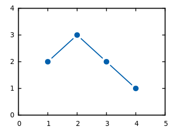
If you have measurement data and like to plot them as points combined by lines, you will probably do that with the linespoints plotting style. But for some applications it is required to combine the data points by non-continuous lines to emphasize that the data came from measurements as shown in Fig. 1.

Fig. 1 Plot of the data from plotting_data1.dat with non-coninuous lines between its points (code to produce this figure)
In Gnuplot exists no line style that can do this directly. But with a little trick it is very easy to achieve. Since Gnuplot 4.4. there exists the property pointinterval (see the documentation) in combination with the plotting style linespoints. This property plots not every single point, but only every second for a value of 2 and so on. But if we use the value -1 it tells Gnuplot to insert a little gap between the points and the line. The size of the gap can be set by the pointintervalbox property.
set style line 1 lc rgb '#0060ad' lt 1 lw 2 pt 7 pi -1 ps 1.5
set pointintervalbox 3
We specify a point interval pi of -1 and a point size of 1.5, in addition we set the the gap to a point size of 3. Now we can plot our data with the linespoints style.
plot 'plotting_data1.dat' with linespoints ls 1
Using the same data as in the first plot of the gnuplot basics tutorial Plotting data we will get Fig. 1 as a result.
Looks good. An advice for reproducing this style in the key?
Hi Luke,
I was also wondering about that. Turns out you can do:
set key spacing -1
plot ‘plotting_data1.dat’ with linespoints ls 1 title “title for the key”, \
” with points ls 2 title ” ”
If you give a plot a blank title it won’t show up in the key, but if you give it a title that’s a single space character it’ll show up. Setting the key spacing to -1 will overlay the two key entries, which will achieve what we want. This will only work for a single key entry, and for a vertically spaced key (though there’s no difference between horizontal and vertical spacing with a single entry).
I have updated the code to a more easier and gnuplot 4.6 compatible form
Lovely, thanks for the writeup.
Nice plot. However when I want to run it in my mac I got the following error:
set pointintervalbox 2
^
line 31: Unrecognized option. See ‘help set’.
I can’t figure out what wrong!
Maybe your gnuplot version is to old. Can you check what version you are running?
Is there a possibility to use this style with overlapping curves (see http://postimg.org/image/3thtv0gxx/) without “cutting” the other curves?
I have tried to find a similar line style in other plotting tools (pgfplots and matplotlib), but I couldn’t find a similar representation.
[…] I like following linespoints plotting style:http://www.gnuplotting.org/join-data-points-with-non-continuous-lines/ […]
I have created a stackoverflow question: http://stackoverflow.com/questions/30297735/plot-data-points-with-connecting-lines-but-which-leave-gaps
Extremely useful. Thanks.
Hi Hagen, I’ve tried this using the aqua terminal but it doesn’t seem to work. Is this purely because of the terminal or can I turn some settings when setting aqua (i.e. setting `dashed` for dashed lines, since it is not default)? Thanks!