Gnuplotting

Create scientific plots using gnuplot

October 6th, 2010 | 14 Comments

If we want to plot a single point, we can do this by creating a data file, containing only one line:

# x   y
1   2

But there exist an easier method without any additional data file. In Fig. 1 three points with different symbols are plotted.

Three points

Fig. 1 Plot of three single points (code to produce this figure)

To achieve this we just use the following command:

plot '-' w p ls 1, '-' w p ls 2, '-' w p ls 3
1 2
e
2 1
e
3 1.5
e

We use the possibility to tell Gnuplot with the '-' input to read from standard input. Here we tell Gnuplot to do this three times. After the plot command the data is entered. Every single data entry have to ended with the e line.
In order to have different symbols for the points we set them before:

set style line 1 lc rgb 'black' pt 5   # square
set style line 2 lc rgb 'black' pt 7   # circle
set style line 3 lc rgb 'black' pt 9   # triangle

Note: if we want to use the replot command then the above code will not work probably. But the same can be achieved by using:

plot "<echo '1 2'"   with points ls 1, \
     "<echo '2 1'"   with points ls 2, \
     "<echo '3 1.5'" with points ls 3

September 23rd, 2010 | 5 Comments

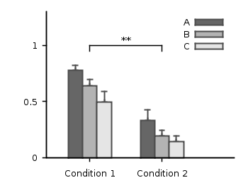
In the last entry we had mean and standard variation data for five different conditions. Now let us assume that we have only two different conditions, but have measured with three different instruments A, B and C. We have used a ANOVA to verify that the data for the two conditions are significant different. As a result the plot in Fig. 1 should be created.

statistics

Fig. 1 Plot the mean and variance of the given data (code to produce this figure)

Therefore we store our data in a format, that can be used by the index command in Gnuplot. Note that the data have two empty lines between the blocks in the real data file:

# mean      std
# A
0.77671    0.20751
0.33354    0.30969
 
 
# B
0.64258    0.22984
0.19621    0.22597
 
 
# C
0.49500    0.31147
0.14567    0.21857

Now every instrument is stored in a different data block containing both conditions as columns.

The color definitions and axes settings are done in a similar way as in the previous blog entry. Note that we have to define two more colors for the boxes, because we use three different colors. Also we define a black line to plot the significance indicator (arrow).

set style line 1 lc rgb 'gray30' lt 1 lw 2
set style line 2 lc rgb 'gray40' lt 1 lw 2
set style line 3 lc rgb 'gray70' lt 1 lw 2
set style line 4 lc rgb 'gray90' lt 1 lw 2
set style line 5 lc rgb 'black' lt 1 lw 1.5
set style fill solid 1.0 border rgb 'grey30'

The significance indicator is created by three black arrows and a text label:

# Draw line for significance test
set arrow 1 from 0,1 to 1,1 nohead ls 5
set arrow 2 from 0,1 to 0,0.95 nohead ls 5
set arrow 3 from 1,1 to 1,0.95 nohead ls 5
set label '**' at 0.5,1.05 center

For the plot the index command is used to plot first condition A, then B and then C by using block 0,1, and 2 respectively. The x-position of the boxes for instrument A are slightly shifted to the left, the ones for C to the right by subtracting or adding the value of bs. The value of bs has the width of one box in order to plot the boxes side by side.

# Size of one box
bs = 0.2
# Plot mean with variance (std^2) as boxes with yerrorbar
plot 'statistics.dat' i 0 u ($0-bs):1:($2**2) notitle w yerrorb ls 1, \
     ''               i 0 u ($0-bs):1:(bs) t 'A' w boxes ls 2, \
     ''               i 1 u 0:1:($2**2) notitle w yerrorb ls 1, \
     ''               i 1 u 0:1:(bs) t 'B' w boxes ls 3, \
     ''               i 2 u ($0+bs):1:($2**2) notitle w yerrorb ls 1, \
     ''               i 2 u ($0+bs):1:(bs) t 'C' w boxes ls 4

September 9th, 2010 | No Comments

If we have done a experiment in order to apply a significance test like a ANOVA to our measured data, we are interested in presenting our statistical data in a familiar way.
Let us assume we have the following mean and standard deviation data for five different conditions:

"A"     0.66257     0.41854
"B"     0.70842     0.38418
"C"     0.66733     0.44059
"D"     0.45375     0.52384
"E"     0.43900     0.53116

The results for the last two conditions are significant different from the first ones. Using this data we want to create a plot that looks like the one in Fig. 1.

mean and variance

Fig. 1 Plot the mean and variance of the given data (code to produce this figure)

To achieve the plot in Fig. 1 we have to define two different color styles for the color of the errorbars and the color of the boxes. Also, we need the fill style (solid) for the boxes and the gray line around the boxes which is given by the border rgb 'grey30' option to the set style fill command. For the line color we choose the same color as for the errorbars:

set style line 1 lc rgb 'grey30' ps 0 lt 1 lw 2
set style line 2 lc rgb 'grey70' lt 1 lw 2
set style fill solid 1.0 border rgb 'grey30'

For the first line style which is used to plot the errorbars also a point size of 0 is specified in order to plot only the errorbars and no points on top of the boxes.

The *-dots above the two last conditions to indicate their significant difference are just added as labels. The border of the graph on the top and right side is removed by set border 3 (see here for an explanation of the number codes) and by using the nomirror option for the tics. The xtics are not visible, because we set them to scale 0.

set label '*' at 3,0.8 center
set label '*' at 4,0.8 center
set border 3
set xtics nomirror scale 0
set ytics nomirror out scale 0.75 0.5

Then we plot first the errorbars in order to overlay the boxes on it, so only the top half of the errorbars will be visible. Note that we have standard deviation data in the data file, therefore we have to use their squares in order to get the variance. As xtic labels we use the first row in the data file by appending xtic(1):

plot 'simple_statistics.dat' u 0:2:($3**2) w yerrorbars ls 1, \
     ''                      u 0:2:(0.7):xtic(1) w boxes ls 2

August 29th, 2010 | No Comments

If you are want to use another format for your data, e.g. a csv file with a comma as seperator, you can easily tell Gnuplot this by:

set datafile separator ','

August 13th, 2010 | 7 Comments

In Gnuplot it is easy to define a continuous and differentiable function such as f(x) = x, but what to do if we need a function that fulfill non of these conditions?
For example let us consider a step function. Typically a step function is given by

           / 1   if x > a
step(x) = -|
           \ 0   else

In Gnuplot this can be achieved by using the ternary operator:

step(x) = x>a ? 1 : 0

Which is a simple if-else statement and means step(x)=1 if x>a else step(x)=0.

If we plot this function we get Fig. 1.

step function

Fig. 1 Continuous plot of the step function (code to produce this figure)

As you can see this will result in a continuous plot. If we want a discontinuity in the plot, we have to create two separate functions that are only piecewise defined. This can be achieved by using 1/0 that will result in a undefined value.

f(x) = x<a  ? 1 : 1/0
g(x) = x>=a ? 1 : 1/0 

Plotting both functions will result in Fig. 2.

step function

Fig. 2 Discontinuous plot of the step function (code to produce this figure)

The ternary operator can also be used in an iterative way. For example if we want to define a rectangular function that is given by

           / 0     if abs(x) > 0.5
rect(x) = -| 0.5   if abs(x) = 0.5
           \ 1     if abs(x) < 0.5

we can use the following statement in Gnuplot to define it:

rect(x) = abs(x)>0.5 ? 0 : abs(x)<0.5 ? 1 : 0.5

In Fig. 3 you can see a plot of this function. To produce the sharp edges of the rectangular function we use a higher number of sampling points (also in Fig. 1 for the step function). In order to plot a function Gnuplot calculates 100 points of the given function and draw a line through them. This can be set to another value with the set samples <value> command.

rectangular function

Fig. 3 Plot of the above defined rect(x) function (code to produce this figure)

July 27th, 2010 | 1 Comment

In the introduction I have set the xtics labels manually to use a multiple of π:

set xtics ('-2π' -2*pi, '-π' -pi, 0, 'π' pi, '2π' 2*pi)

But there is an easier way to achieve the same. First we tell Gnuplot to place the tics at multiplies of π. And then the trick: with the set format option we can tell Gnuplot to use multiple of π too:

set xtics pi
set format x '%.0Pπ'

In the same way we can place tics without any label by applying:

set format x ''

July 20th, 2010 | 15 Comments

Last Update: 2011-07-11

Ubuntu 10.04 (Lucid Lynx) contains not the newest Gnuplot package, but the old 4.2 version. To install Gnuplot 4.4 under Ubuntu you can download it from Debian squeeze and install it by:

wget http://ftp.us.debian.org/debian/pool/main/g/gnuplot/gnuplot-nox_4.4.0-1.1+b1_i386.deb
wget http://ftp.us.debian.org/debian/pool/main/g/gnuplot/gnuplot-doc_4.4.0-1.1_all.deb
wget http://ftp.us.debian.org/debian/pool/main/g/gnuplot/gnuplot-x11_4.4.0-1.1+b1_i386.deb
wget http://ftp.us.debian.org/debian/pool/main/g/gnuplot/gnuplot_4.4.0-1.1_all.deb
sudo dpkg -i gnuplot*

It can happen that some features of Gnuplot (for me the readline stuff) do not work as expected. If you experience problems, then you have to compile gnuplot yourself, which is in most cases straight forward. You can download it from sourceforge.

July 11th, 2010 | 5 Comments

In the Gnuplot demo files folder that comes with your Gnuplot installation exists the file world.dat which contains data in order to plot a map of the world. Therefore we remove the key from the figure and set a grid (the dashed line in Fig. 1). Also we remove the tics by setting the format to nothing and the scale to zero. We could also remove the tics with unset tics, but the grid depends on the tics positions. After that we just plot the data:

unset key
set grid
set format ''
set tics scale 0
plot 'world.dat' with lines linestyle 1
The world

Fig. 1 A 2D plot of the world (code to produce this figure)

Here you can see a problem of the svg terminal of Gnuplot: it can’t produce dashed lines. In order to fix this, we can use Inkscape and open the svg file. Then pressing CRTL+F and type gray into the Style field and hit Enter. Now all the grid lines should be selected and you can set their stroke style to dashed by typing CRTL+Shift+F and choose one under Dashes. Doing so will lead to a figure shown in Fig. 2.

The world

Fig. 2 The 2D plot of the world edited with Inkscape

We can also easily draw a whole globe in 3D from the given data. Therefore we first add a gray line style, unset the border and arrange the figure margins.

set style line 2 lc rgb '#c0c0c0' lt 1 lw 2
unset border
set lmargin screen 0
set bmargin screen 0
set rmargin screen 1
set tmargin screen 1

The 3D plot needs a little more settings. We have to tell Gnuplot to map the data on a sphere and using angle values in degree. Also we want to have a non transparent world, therefore we need hidden3d. We arrange the appeareance of the plot by setting the xy-plane to the lowest z value in order to avoid an
offset between the lowest z vlaue an the xy-plane. To have Europe in the center we set also the viewport.

set mapping spherical
set angles degrees
set hidden3d
set xyplane at -1
set view 56,81

For the grid we have to remove the set grid command, because it doesn’t work with splot. So we draw the grid by our own using the parametric mode and finally plot the whole globe:

set parametric
set isosamples 25
set urange[0:360]
set vrange[-90:90]
splot cos(v)*cos(u),cos(v)*sin(u),sin(v) with lines linestyle 2, \
      'world.dat' with lines linestyle 1
The world

Fig. 3 A 3D plot of the world (code to produce this figure)

As you can see we have some problems with the data for Africa which lies behind the grid at some points. To avoid this and to make the grid dashed again we draw a grid with tinier radius and use Inkscape.

r = 0.99
splot r*cos(v)*cos(u),r*cos(v)*sin(u),r*sin(v) with lines \
      linestyle 2, \

In order to select the grid in Inkscape we have to search after the Style blue for some strange reason (on another PC green was the right color to search). You may have a look at the xml data to figure this out. Therefore under Edit you will find XML Editor. We not only set the stroke style to dashed we also lowered the selected objects
to avoid that any line of the grid covered a black world line. Having done all that we will finally get the nice globe in Fig. 4.
The world

Fig. 4 The 3D plot of the world edited with Inkscape

June 22nd, 2010 | 6 Comments

If you use the postscript terminal and have a greek letter e.g. Φ for the xlabel, it should be italic because it is a variable.
To get the greek letter you have to use the enhanced mode of the terminal and can write

set xlabel '{/Symbol P}'

But this produces a non italic Φ and it is not obvious how to get it italic. For normal letters the following will work

set xlabel '{/Helvetica-Italic P}'

and produces a P. But for the Symbol font Italic is not the right notation, instead you have to use Oblique:

set xlabel '{/Symbol-Oblique P}'

This will finally generate our desired italic Φ.

Update: in the meantime I have learned Helvetica-Italic is not part of the official postscript core fonts. Hence, use also Helvetica-Oblique.

June 9th, 2010 | 11 Comments

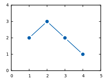
If you have measurement data and like to plot them as points combined by lines, you will probably do that with the linespoints plotting style. But for some applications it is required to combine the data points by non-continuous lines to emphasize that the data came from measurements as shown in Fig. 1.

Plotting data

Fig. 1 Plot of the data from plotting_data1.dat with non-coninuous lines between its points (code to produce this figure)

In Gnuplot exists no line style that can do this directly. But with a little trick it is very easy to achieve. Since Gnuplot 4.4. there exists the property pointinterval (see the documentation) in combination with the plotting style linespoints. This property plots not every single point, but only every second for a value of 2 and so on. But if we use the value -1 it tells Gnuplot to insert a little gap between the points and the line. The size of the gap can be set by the pointintervalbox property.

set style line 1 lc rgb '#0060ad' lt 1 lw 2 pt 7 pi -1 ps 1.5
set pointintervalbox 3

We specify a point interval pi of -1 and a point size of 1.5, in addition we set the the gap to a point size of 3. Now we can plot our data with the linespoints style.

plot 'plotting_data1.dat' with linespoints ls 1

Using the same data as in the first plot of the gnuplot basics tutorial Plotting data we will get Fig. 1 as a result.