February 6th, 2013 | 8 Comments
Maybe you all know the nice example of gnuplots transparent fill style. I have replotted it slightly modified in Fig. 1.
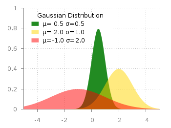
Fig. 1 Filledcurves with transparency settings as on the gnuplot demo site (code to reproduce this figure)
The interesting part in the code looks like this.
set style fill transparent solid 0.5 noborder
plot d1(x) fs solid 1.0 lc rgb "forest-green" title 'µ= 0.5 σ=0.5', \
     d2(x) lc rgb "gold" title 'µ= 2.0 σ=1.0', \
     d3(x) lc rgb "red" title 'µ=-1.0 σ=2.0'
The set style command sets the fill style to 50% transparency, which is overwritten by the explicit fs option to the first plotting command in order to plot the green curve without transparency.
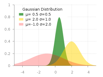
Fig. 2 Filledcurves with different transparency settings (code to reproduce this figure)
Now the question is how to plot filled curves with different transparency settings? The simple answer is, by just using this explicit fs plot argument. The result is shown in Fig.2 and can be reached with the following code. Now we apply a transparency of 75%, 50%, and 25% going from the green to the red curve.
set style fill noborder
plot d1(x) fs transparent solid 0.75 lc rgb "forest-green" \
        title 'µ= 0.5σ=0.5', \
     d2(x) fs transparent solid 0.50 lc rgb "gold" \
        title 'µ= 2.0 σ=1.0', \
     d3(x) fs transparent solid 0.25 lc rgb "red" \
        title 'µ=-1.0 σ=2.0'
