August 11th, 2011 | 6 Comments
As you surely have noticed I don’t use the default colors and line styles from Gnuplot, but define them myself. The simple reason is that the default colors are not optimized to be very pleasant, but are simply primary colors. I just stumbled over an blog entry of Brighten Godfrey, which deals with some thoughts on beautiful plots.
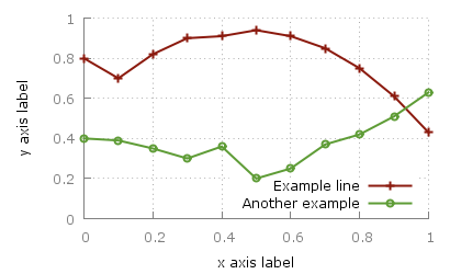
He suggest to create scientific plots like the way he created his figure which I have reproduced more or less accurate in Fig. 1.

Fig. 1 Nice plot with the pngcairo terminal (code to produce this figure, data)
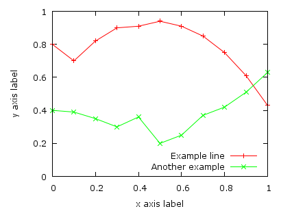
In Fig. 2 the default output of the pngcairo terminal is shown. I think the difference is quiet obvious.

Fig. 2 Default output of the pngcairo terminal (code to produce this figure, data)
In the following I will have a look at the things we have to do to reach Fig. 1 and why we should do this:
1) change the default colors to more pleasant ones and make the lines a little bit thicker
set style line 1 lc rgb '#8b1a0e' pt 1 ps 1 lt 1 lw 2 # --- red
set style line 2 lc rgb '#5e9c36' pt 6 ps 1 lt 1 lw 2 # --- green
2) put the border more to the background by applying it only on the left and bottom part and put it and the tics in gray
set style line 11 lc rgb '#808080' lt 1
set border 3 back ls 11
set tics nomirror
3) add a slight grid to make it easier to follow the exact position of the curves
set style line 12 lc rgb '#808080' lt 0 lw 1
set grid back ls 12
The last thing I would like to mention is the problem, that the output of the svg terminal is slightly different from the pngcairo terminal. Especially the dashed line of the grid is not created in the right way, even though the dashed option is used for the terminal. This and a solution to convert the lines to dashed versions is also mentioned in the plotting the world entry.
Fig. 1 Nice plot with the svg terminal (code to produce this figure, data)
[…] in Gnuplot 4.6 and tips to make the final figure look sharper. Check the post titled Attractive plots. This how gnuplot should look like. Nice plot from Gnuplotting Default gnuplot […]
Hi Hagen! First of all, your labour in this website is inspiring. I wish scientists pay at least a 1/10 of the dedication you pay to plotting.
Second, a question. Suppose you’re using multiplot option, in a way that there is a main plot and a zoom of it. Then suppose that you define a grid on the main plot and another grid in the zoom plot. It occurs that the “main grid” also get into in the zoom plot! For me, the mix of grids in the zoom plot doesn’t look OK. Do you know a way to, for example, define a white background for the zooms and then define the grid?
Thank you very much! Greetings from Buenos Aires
Hi Alejandro.
I know this problem and solved it by including a white rectangle in my plot under the zooming part.
I created a new entry for this: http://www.gnuplotting.org/zooming-in-with-multiplot/
Thanks for the nice question.
/Hagen
One should also refrain from using red and green colors in plots. It is not nice to the colorblind. Especially in heatmaps and the like. Also it is a good idea to make each plot stile distinct in gamma value and dot type (to make lines distinguishable when converted to greyscale).
Just my two cents.
Thank you very much hagen!
sorry for the delay —one year is nothing (?). By that time I was writting my master thesis and I was so busy and exhausted that I didn’t remember to come back again to the site and see your answer.
Today I came back because of a different issue to this page and saw it. Should I see your answer a year ago, today that plot on my printed thesis will not have two overlaying grids jaja.
Gnuplot 5.0 defaults to a colorblind-friendly set of colors. I have normal color vision, but find the second and third colors (dark green and light blue) a bit hard to distinguish. However, setting “lw 2” helps.
Unfortunately the png terminal still doesn’t support dashed lines, and with OS X, the pngcairo terminal is not available (at least with the homebrew version of gnuplot). I need to import the images into Microsoft Word, so I’m currently using the emf terminal.