September 29th, 2014 | 6 Comments
Some time ago I introduced already a waterfall plot, which I named a pseudo-3D-plot. In the meantime, I have been asked several times for a colored version of such a plot. In this post we will revisit the waterfall plot and add some color to it.

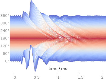
Fig. 1 Waterfall plot of head related impulse responses. (code to produce this figure, color palette, data)
In Fig. 1 the same head related impulse responses we animated already are displayed in a slightly different way. They describe the transmission of sound from a source to a receiver placed in the ear canal dependent on the position of the source. Here, we show the responses for all incident angles of the sound at once. At 0° the source was placed at the same side of the head as the receiver.
The color is added by applying the Moreland color palette, which we discussed earlier. The palette is defined in an extra file and loaded, this enables easy reuse of defined palettes. In the plotting command the palette is enabled with the lc palette command, that tells gnuplot to use the palette as line color depending on the value of the third column, which is given by color(angle).
load 'moreland.pal'
set style fill solid 0.0 border
limit360(x) = x180?360-x:x
amplitude_scaling = 200
plot for [angle=360:0:-2] 'head_related_impulse_responses.txt' \
    u 1:(amplitude_scaling*column(limit360(angle)+1)+angle):(color(angle)) \
    w filledcu y1=-360 lc palette lw 0.5
To achieve the waterfall plot, we start with the largest angle of 360° and loop through all angles until we reach 0°. The column command gives us the corresponding column the data is stored in the data file, amplitude_scaling modifies the amplitude of the single responses, and +angle shifts the data of the single responses along the y-axis to achieve the waterfall.
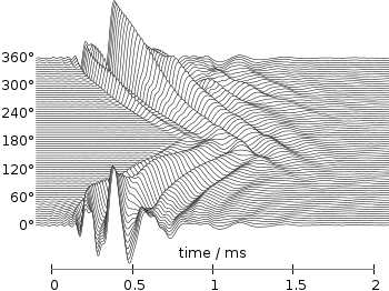
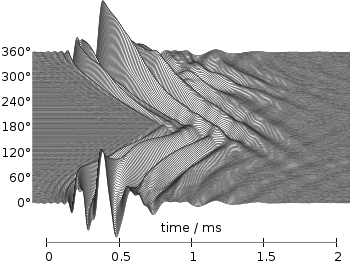
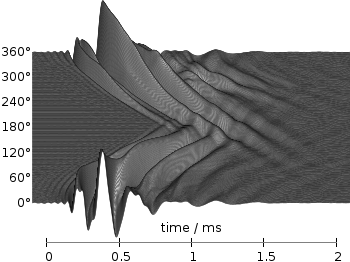
Even though the changing color in the waterfall plot looks nice you should always think if it really adds some additional information to the plot. If not, a single color should be used. In the following the same plot is repeated, but only with black lines and different angle resolutions which also have a big influence on the final appearance of the plot.

Fig. 2 Waterfall plot of head related impulse responses with a resolution of 5°. (code to produce this figure, data)

Fig. 3 Waterfall plot of head related impulse responses with a resolution of 2°. (code to produce this figure, data)

Fig. 4 Waterfall plot of head related impulse responses with a resolution of 1°. (code to produce this figure, data)
Looks great, Exactly what I need. Thansk for your advice and help.
Dude, it’s great. You can be sure i’ll use it – you just got a part in visualisation of Bose-Einstein condensate simulations.
I was looking for a way to use the plot for command with decimals. I found this page but I wasn’t able to produce a result with this command
plot for [h=0:1:0.1] sin(x*h)
So I asked in the StackOverflow and a nice gentleman tells me that the increment of the for loop in gnuplot is “cast” to integer. So in your example, the increment is actually -2.
If you want to check the question here is the link: http://stackoverflow.com/questions/33244494/gnuplot-for-loop-with-increment-smaller-then-1
Also in the gnuplot manual, page 98, it is written the following:
“The iteration variable (’i’ in this example) is treated as an integer, and may be used more than once.”
Hope this helps!
Hi, thanks, iteration is indeed only possible with integer values. I changed the post accordingly.
Nice example but I’ve had a hard time to reproduce it. In both version 5.0.4 and 5.0.6 the “border” keyword for the fill style appears to be ignored when the y1=-360 is set. So all you get is white on white. Couldn’t find a fix for but it works in 5.0.0 so I just used the older version.
Hi,
Is it possible to change the background colour of a graph such that the interior of the graph (within the axes) is of one colour, and the exterior (outside the axes) is of another colour?
Thanks!